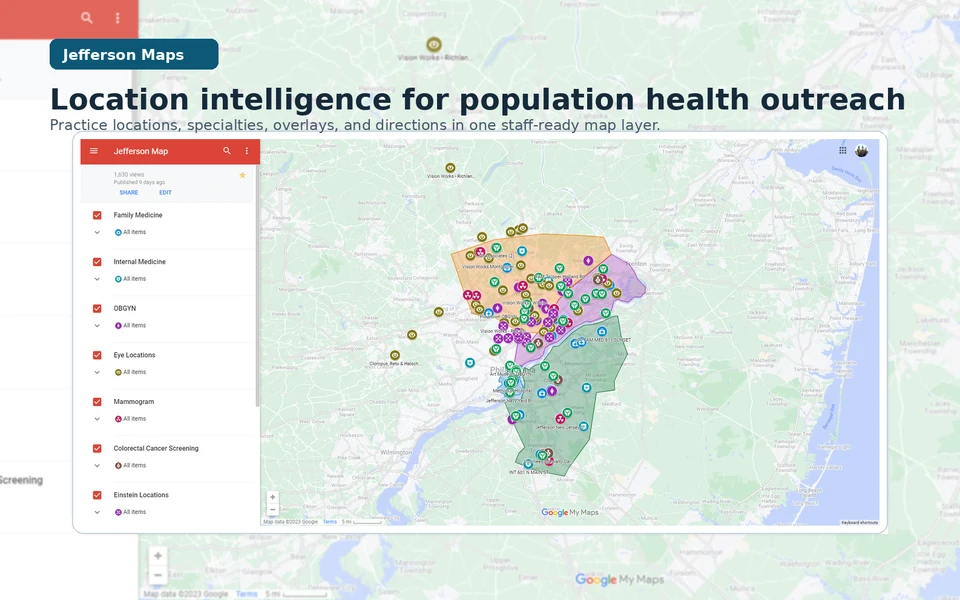
Jefferson Maps: Local Intelligence at Call Speed
A no-PHI location-intelligence layer that helped Jefferson Health Enterprise Population Health turn local knowledge into active guidance during outreach calls.
Operating context
Jefferson Health Enterprise Population Health
2023
- Role relationship
- Location intelligence builder and workflow maintainer
- Contribution
- I identified the local-knowledge dependency, assembled and structured practice and location data, created the map and specialty/overlay system, refined it through staff use, maintained it, and trained a colleague for handoff. Outreach coordinators, navigators, practice coaches, and leaders supplied operating knowledge and used the system; I do not claim their work as my own.
- Result
- The no-PHI layer covered at least 61 documented locations and later expanded substantially without a final count being asserted. The combined 2023 process-improvement package that included Jefferson Maps was associated with roughly a 25% increase in call-to-schedule conversion and a movement in no-show complaints from roughly 2–3 per week to roughly 2–3 per month; those signals are not attributed to the map alone.
The operating question was practical
Jefferson Health Enterprise Population Health was working across an ambulatory footprint where a call could turn on one practical question: what nearby care option can a staff member explain clearly enough for a patient to act? Answering it required local knowledge that could be shared and checked, instead of depending on who happened to remember every practice, specialty, address, or route.
I built Jefferson Maps as a no-PHI, spreadsheet-backed location layer with Google Maps and QGIS-created overlays. It organized practice and location information—specialty, address, phone, hours when documented, and useful landmarks—so outreach coordinators, care navigators, practice coaches, and leaders could verify a next option at call speed, while patient data stayed outside the map's operating surface.
Guided choice
From a patient need to a guided choice
-
Patient need
Name the practical barrier
Listen for the care gap and the constraint that may stop a willing patient from acting: distance, unfamiliarity, specialty, or a route that is hard to explain.
-
Local intelligence
Verify the care context
Use the shared layer to check the practice, location, service line, and documented contact details instead of routing from memory alone.
-
Guided choice
Offer a workable next step
Put the verified option into plain language and let the patient choose a path that fits their circumstances; the map supports guidance, not a promise about what a clinic can offer.
A representative call, reconstructed
The exchange below is a representative reconstruction, not a verbatim transcript. It shows the change in operating posture: from a lookup delay to active guidance grounded in a shared location reference. It includes no patient identifiers or PHI.
A representative reconstruction
01 Before the shared layer
Patient Do you have a location near me?
Staff member I’m not familiar with that area. I can look it up and get back to you.
02 With Jefferson Maps
Patient Do you have a location near me?
Staff member I can see two nearby options for that service. Let’s compare the locations and the route that would work better for you.
What changed was the staff member's ability to verify a provider and location while the call was live, explain the relevant context, and keep the decision with the patient. That active guidance is a small form of concierge-level care that can be made available at population scale.
Building a shared local reference
The first layer came from practice-directory spreadsheets and public Jefferson location information. I normalized the records, grouped them by specialty, and added QGIS-created overlays that made the footprint easier to scan in Google Maps / Google My Maps. The model stayed legible: a practice name, service line, address, phone or extension, documented hours, practical notes, and a marker that made categories visible without replacing the source detail.
Provider and location verification was part of the workflow. The map was useful only when a staff member could check the underlying directory or public location source, notice when a detail needed maintenance, and avoid treating a pin as proof that a service was open or available. The goal was a dependable handoff between source facts and a human conversation.
Evidence folio
Specialty layers and practice footprint
A preserved 2023 specialty and practice-footprint view shows how local knowledge became a shared visual reference. The layer was assembled from practice-directory spreadsheets, public Jefferson location information, and QGIS-created overlays; it contains practice and location information, not patient-level records.
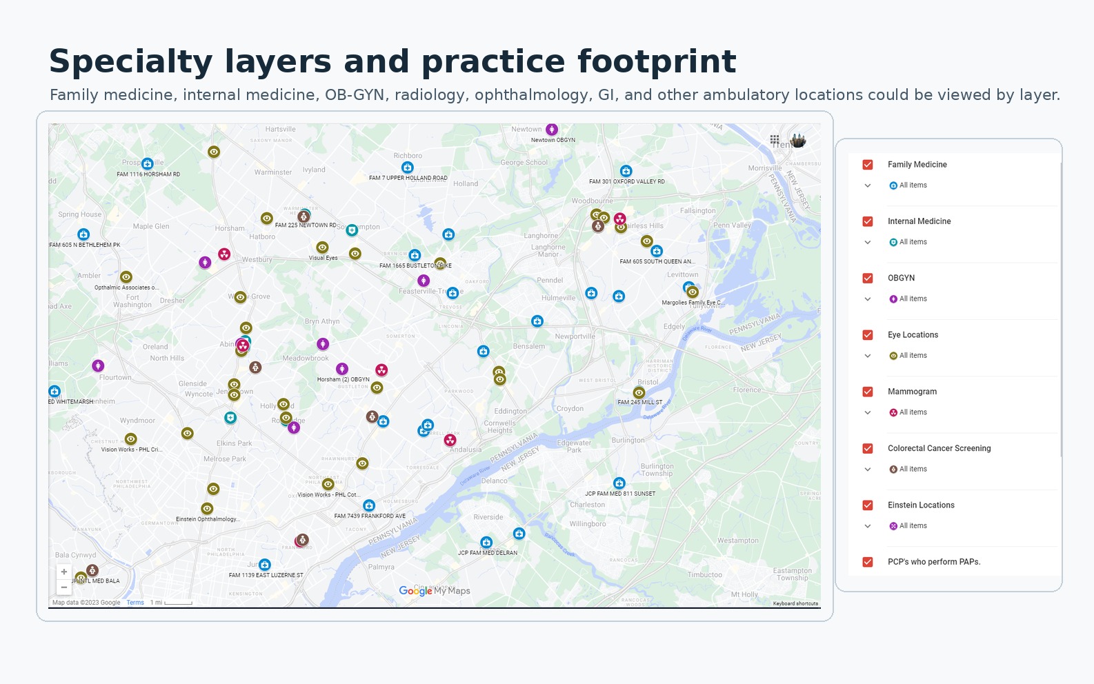
This preserved 2023 specialty and practice-footprint view keeps the map's natural labels, legend, pins, and edge context visible. It shows how a call-speed reference can be maintained without turning the image into a patient record.
The documented layer covered at least 61 locations and later expanded substantially as more ambulatory services and specialties were incorporated. The operating record does not support a final count.
A route has to be explainable
The second folio shows the companion question: once a location is verified, can the route be explained in ordinary language? The workflow could bring location context and directions together, while staff still checked the source and used judgment about what to offer. The image is navigation context, not a patient-specific journey or a patient record.
Evidence folio
Transit and directions at call speed
A preserved 2023 directions view pairs Jefferson Maps location information with Google Maps routing and transit details. It shows the information staff could use to explain a nearby option while a call was still live.
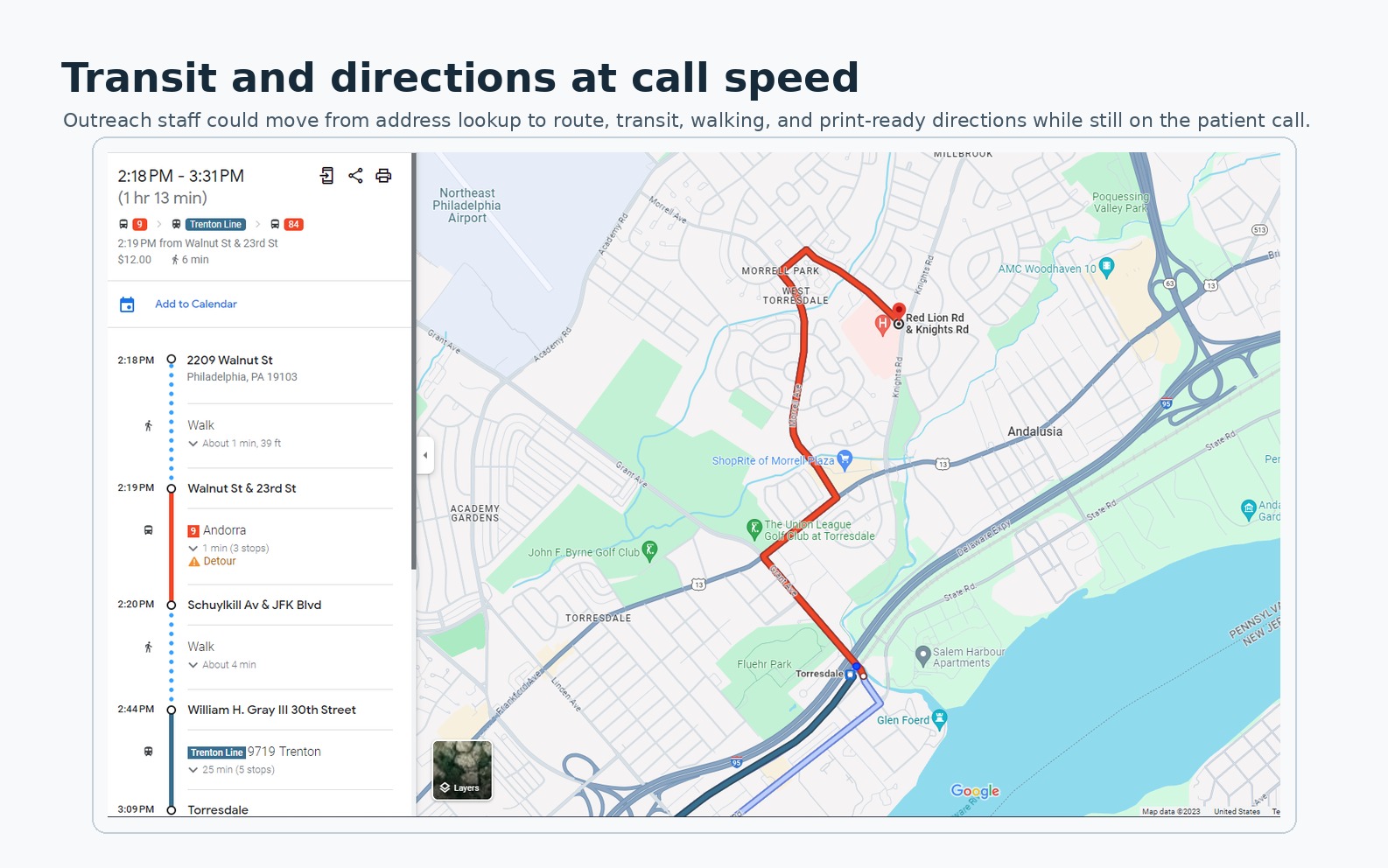
A preserved 2023 route view with the itinerary, walking and transit segments, map line, and surrounding landmarks. Routes and service schedules may have changed.
Maintenance is part of the contribution
Location intelligence drifts as phone numbers change, services move, directory fields are corrected, or ownership becomes unclear. I maintained the layer while I owned the project, then trained a colleague on the maintenance path before handoff, because that continuity was the condition that kept the map from becoming a second source of misinformation.
The participating outreach coordinators, care navigators, practice coaches, and population-health leaders supplied local operating knowledge and used the shared reference. I owned the system design, data structuring, map and overlay construction, refinement through use, maintenance, and training; they owned the clinical and operational work around it.
What the package changed
The internal study context is intentionally rounded. Roughly 28,000 plan patients were in the Jefferson system, roughly 6,200 were overdue for an annual primary-care visit or three-year Pap measure, and the target was under roughly 4,000. The funnel matters because a small amount of friction at the scheduling moment can compound across a constrained reachable population.
Outreach funnel
A constrained reachable population, one scheduling conversation at a time
Data table
| Stage | Value |
|---|---|
| Patients in system | ≈28,000 |
| Overdue for outreach | ≈6,200 |
| Reimbursement target | <4,000 |
| Answered the phone | ≈47% |
| Agreed to schedule (of answered) | ≈62% |
| Showed up (of agreed) | ≈80% |
| Overall success | ≈23% |
The full 2023 process-improvement package that included Jefferson Maps was associated with an approximately 25% increase in call-to-schedule conversion. No-show complaints moved from roughly 2–3 per week to roughly 2–3 per month. These are approximate operational signals associated with the combined package, not a randomized result or a causal estimate for the map layer alone.
Local intelligence at the moment of action
Local intelligence becomes useful care when it is verified, explainable, and maintained at the moment a patient is ready to act. The shared layer reduced lookup friction while leaving judgment, source checking, and handoff ownership with the people doing the work.
The project is a small example of contextual intelligence transforming healthcare by helping a team offer the next grounded choice with the care of a concierge and the reach of a population-health workflow.
Notes
The CDC NCHS transportation brief (2024) measures transportation as an access condition. The CDC NCHS nonfinancial-barriers report (2024) adds distance, scheduling, and other practical constraints.
The CDC patient-navigation guidance describes navigation as help through barriers and services. The AHRQ health-literacy toolkit and CDC health-literacy overview inform the emphasis on understandable next steps.
The ASTP/ONC 2025 portal brief documents digital-access patterns, while the CMS value-based-care framework links care goals to operational action.
The CMS AHC Insight (2026) describes navigation and resource referral at large scale. Nicholson, Hanly, and Celermajer's PLOS Digital Health study (2023) models geography, demographics, travel time, and potential clinic locations.
Versace and colleagues' 2026 Australian Journal of Rural Health commentary argues for address-level and travel-time intelligence, while Gligoric and colleagues' 2023 Communications Medicine study distinguishes potential spatial access from observed travel. These sources frame the design problem; the approximate conversion and complaint signals come from Jefferson's combined 2023 process-improvement record.
Jefferson Health's public locations page shows the institution's current footprint. The exact 2023 mapped set comes from the project visuals and operating record.